VIEWSTATS
by MrBeast
Repositioning a Key Feature to Boost User Retention & Engagement
Under NDA: Some details are anonymized or vague.

Viewstats is an analytical web application that provides YouTube creators with insights that guide them to make data-driven decisions to grow their channels.
What is Viewstats?
My Role
UX/UI Designer
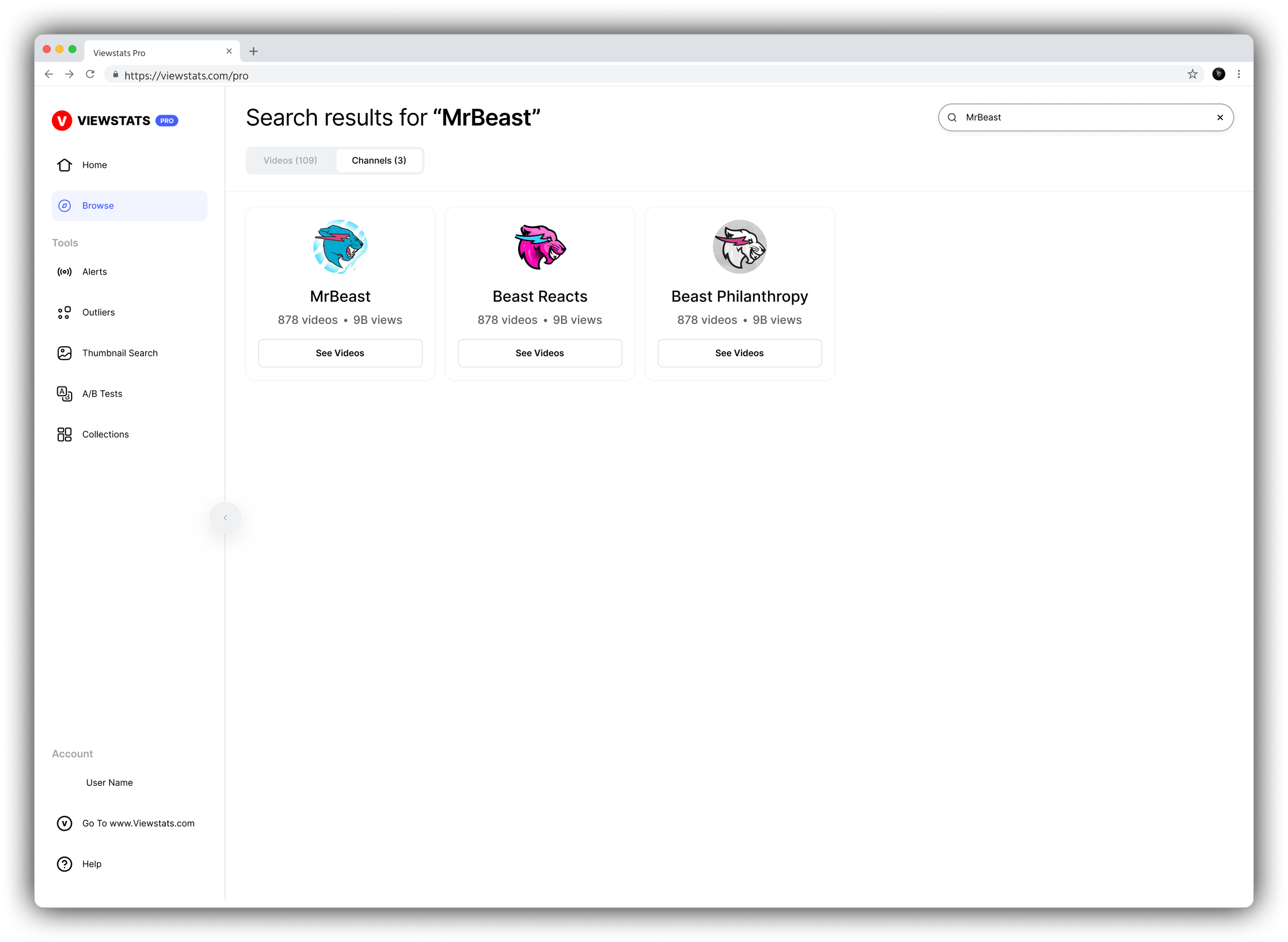
The search bar in the side navigation initially allowed users to paste a YouTube video URL to directly retrieve that exact video’s data. The Product Manager requested changing the functionality to allow keyword searches, leading to a search results page.
The Task

The Task

The Notion Ticket
My initial Notion task was for designing a page where users could browse videos by keyword.
At the time the product had a search function. But was located in the left-side nav, and users could only search by exact URL.
Notion Task
Original Search Bar Placement

The Redesign Process

Competitor Research
I researched the browsing functionality of the following platforms:
Vid IQ - Direct competitor.
Social Blade - Direct competitor.
Playboard - Indirect competitor.
YouTube- Not a competitor. But helped me to better understand user expectations and patterns as over 95% of our users are also YouTube users.
Research
Competitor Browsing Results Screenshots
This research gave me an idea of how to best go about the functionality and layout of the “browse” feature.

User Flows
Pulling inspiration and grasping user expectations from competitor research led me to map out the “ideal” user flow chart.
Ideation
User Flows

During the wireframing process, I encountered a design roadblock. All other pages on the site had the search bar in the upper right-hand corner. Introducing a “browse” page with a search bar in both the side nav and the top bar would be redundant. However, removing it from either location could be confusing for users.
Wireframes
Ideation
Wireframe Options
I chose option c which resulted in me doing more research.

Secondary Research
I analyzed how leading platforms handle search functionality. Platforms like Amazon, Google Drive, Spotify, and YouTube typically place search bars in the header.
Search bars in the side navigation are rare and not industry standard, as they can cause confusion about the search scope. However, I also observed that many tools use search bars for global searches.
Based on Jakob’s Law, I determined that “browse” needed to be its own feature with its own search bar in the header, eliminating the side nav search.
Based on the UX Principle of Consistency the new header search bar was to be clearly labeled with the feature name, indicating it searches within "browse", aligning with the other tools on our platform.
Research
Jakob's Law
"Users spend most of their time on other sites. This means that users prefer your site to work the same way as all the other sites they already know."
Principle of Consistency
"Ensuring uniformity in design and behavior across similar elements and functions within the same product to reduce cognitive load and enhance usability."

Stakeholder Buy-In (CEO & Product Manager)
Presenting the Design Idea:
Dedicated "Browse" Feature: Transform "browse" into its own feature as a clickable tool in the side navigation.
Header Search Bar: Place the search bar in the header within the "browse" feature, clearly labeled to indicate its scope.
Intro Page: Include an intro page recommending videos or keywords to facilitate browsing.
Explaining Jakob's Law:
I highlighted Jakob's Law, which states users prefer familiar site functions, explaining that leading platforms place search bars in the header.
Emphasizing Consistency:
I stressed the importance of consistency. Having a search bar in the side navigation was inconsistent with our other features, which all had search bars in the header. Consistency reduces user confusion and enhances usability.
Addressing Concerns:
I explained that having redundant search bars in both the side navigation and the header would be confusing and emphasized that aligning search bar placement with other tools would meet user expectations.
By clearly presenting these points, I successfully gained approval from the Product Manager and CEO, allowing us to implement the redesigned "browse" feature and enhance the overall user experience.
Validation

Hi-Fidelity Screens
Design

Reflection

Impact
The redesign of the "browse" function had a significant positive impact on user experience. Improving user engagement and satisfaction.
Lesson
As a designer, I learned that the end-to-end design process is often non-linear. It's crucial to view the product as a whole rather than strictly adhering to the initial boundaries of the task. This broader perspective can lead to more innovative and effective solutions.
In this case, stepping back and considering the overall user experience allowed me to create a more cohesive and user-friendly design, ultimately enhancing the product beyond the initial ask.

Conclusion

Thanks for Reading!
Thank you for reviewing my Viewstats case study. Feel free to reach out with any questions or for further discussion.
Don’t forget to check out the full product here!


