Samepage
How I Redesigned a SaaS Product for Better Accessibility and an Intuitive Dashboard

Samepage is a SaaS platform designed to empower GTM (Go-to-Market) teams in their mission to streamline customer experiences from sales to success.
What is Samepage?
My Role
UX/UI Designer
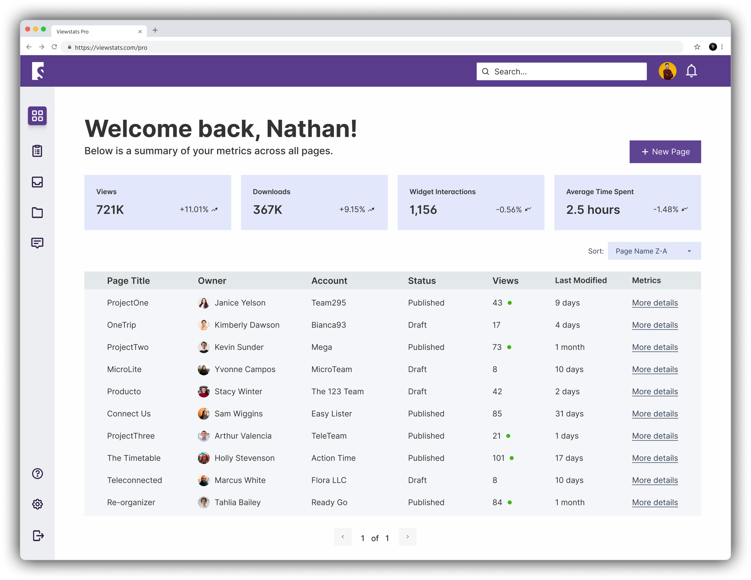
SamePage had an existing design, but wanted to specifically redesign and enhance the user experience of the dashboard/homepage. While the organization had a concept in mind, they wanted the expertise of a UX/UI specialist to create a homepage and design system that incorporated accessibility and UX best practices.
The Task

Discovery

Kickoff & Client Questions
The SamePage project began gathering insights from our client,
I learned:
1. Which KPIs drive impactful decision-making for GTM teams. With this knowledge I was able to design the dashboard to present the data in a digestible and accessible format.
2. How they intend for the Search function to behave. Will the search function for the entire site? Or a page at a time?
Understanding this helped the team to decide on the search placement, size, and overall functionality.
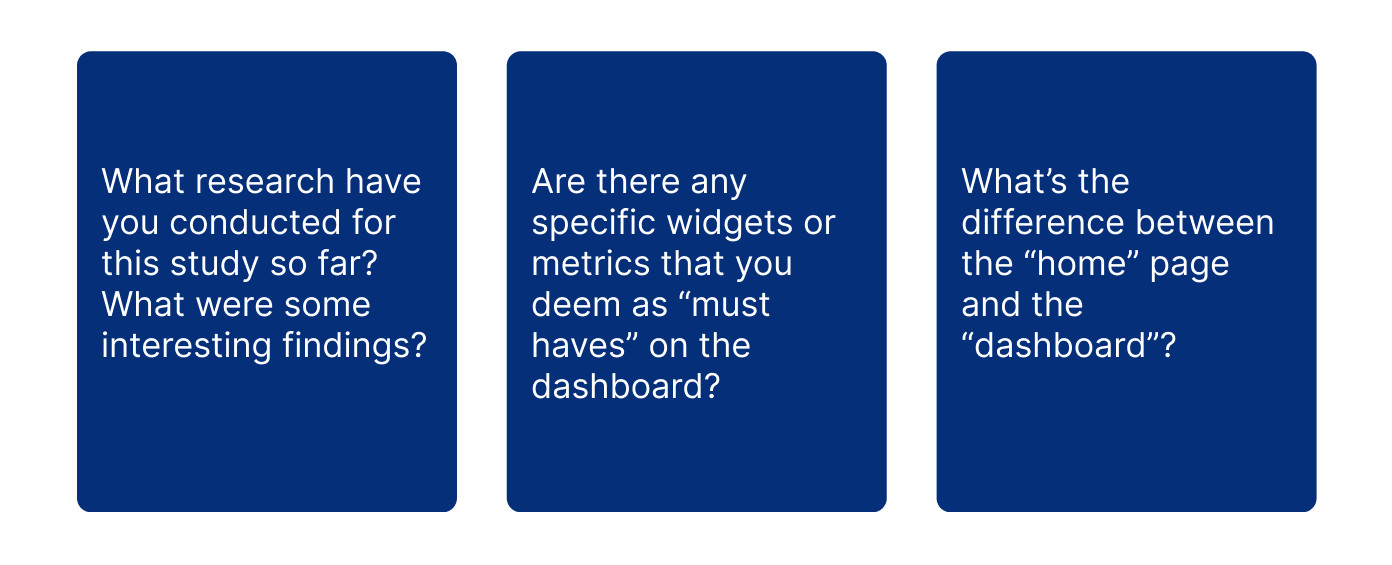
A few kickoff questions
Discovery

Heuristic Analysis
The team conducted a heuristic analysis of the previous SamePage product to gain insights and determine essential elements for the new design.
Key Takeaways:
1. Side Navigation: The side navigation occupies excessive screen space, reducing the available real estate for content.
2. Accessibility: The logo in the side nav does not pass contrast.
Notes From the Heuristic Analysis
Discovery

Competitive Analysis
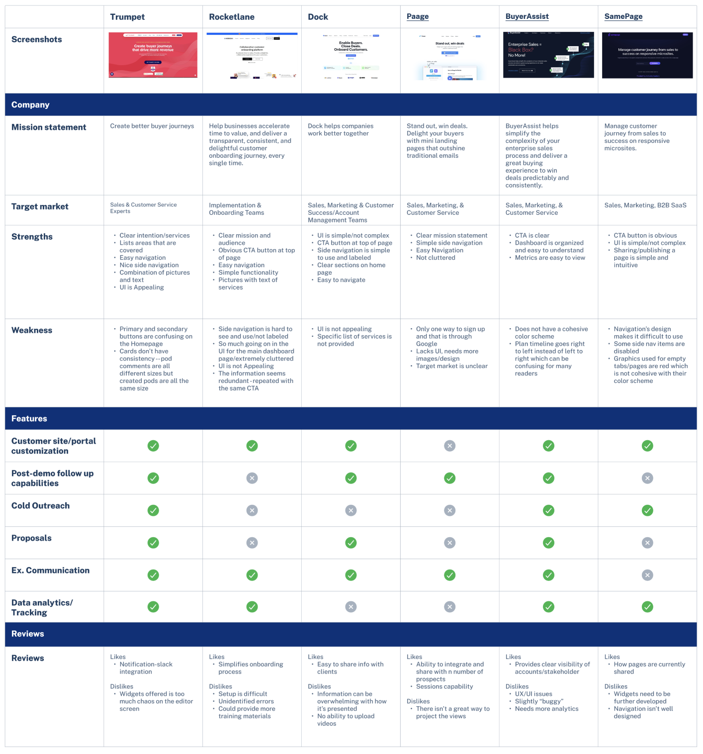
I conducted a thorough competitive analysis of key competitors in the GTM collaboration space. Leveraging my findings, we identified opportunities for differentiation and presented these ideas to the client.
Key Takeaways:
1. Information Overload: Many competitors overwhelm users with excessive information. We differentiate by presenting data concisely and user-friendly, focusing on key insights that are easily digestible.
2. Unappealing UI: Many competitors have unattractive UIs. We stand out by incorporating a visually pleasing and intuitive design. Prioritizing clean and simple aesthetics ensures seamless navigation, enhancing user satisfaction and engagement.
Competitive Analysis
Discovery

Ideation

User Stories
The client provided the team with 5 user stories.
Each designer was responsible for a user flow. I took on the responsibility of designing the process and screens for user flow 3.
User Stories
Ideation

User Flows
Each designer translated their assigned user story into a user flow. I created user flow 3.
This approach helped us identify the necessary screens and clearly define their functionalities.
User flows
Ideation

Wireframes
Prioritizing functionality, we created wireframes to depict the user flows without incorporating any UI elements. To maintain consistency, we developed essential components such as a navigation bar, header, and buttons before proceeding to design screens for each user flow.
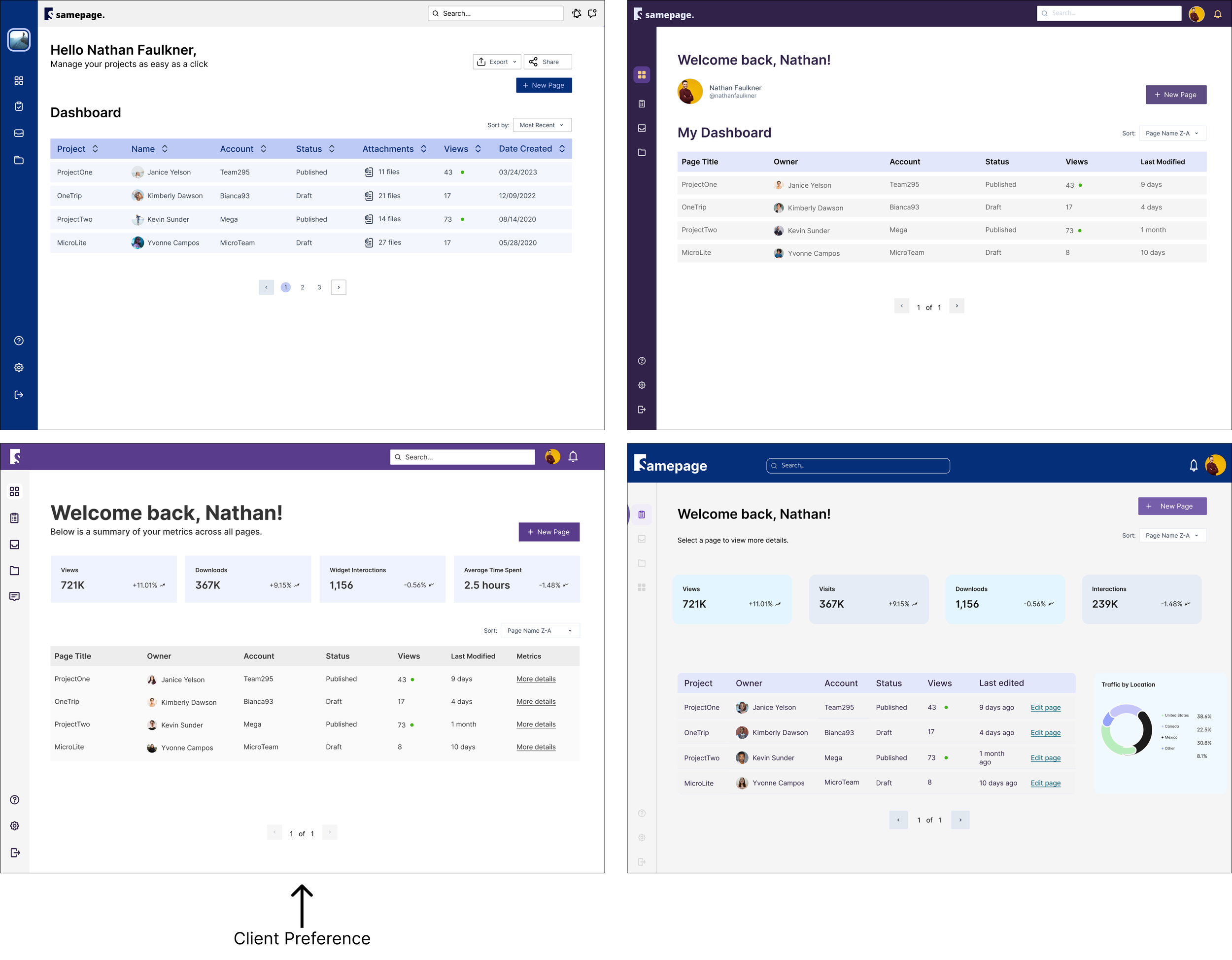
The top right screen is the initial dashboard wireframe that I specifically designed for user flow 3.
Wireframes
Ideation

Design

UI Iterations
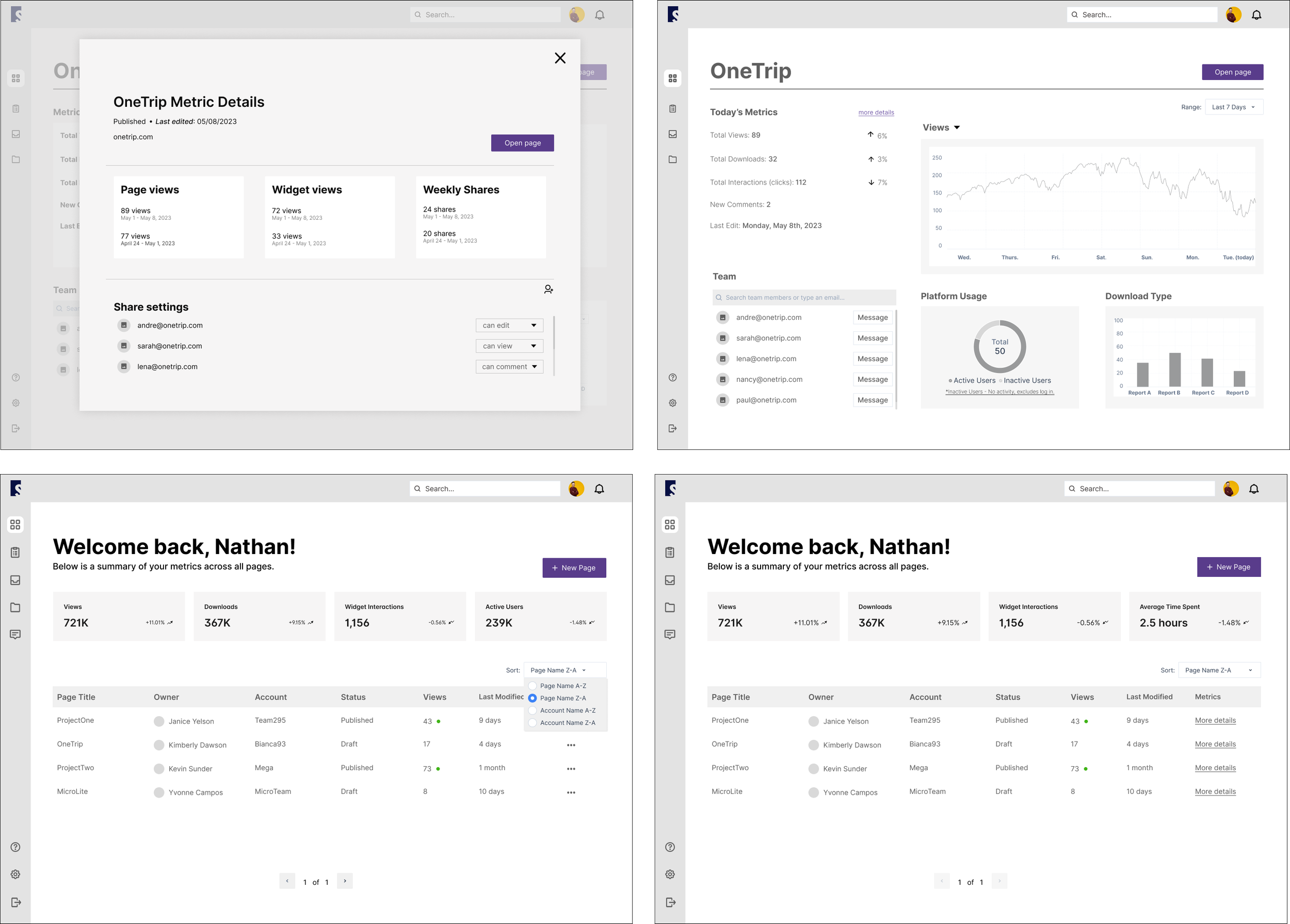
We iterated on the main dashboard page. We decided this was ideal because:
It's the first main screen in every user flow. By finalizing the UI for this screen, it sets the expectations, layout, and UI for the additional pages.
There are many components and layout options to consider and test.
The client chose the home screen layout from the bottom left, and the nav and top bar UI from the screen designed by me (top right).
UI Iterations
Design

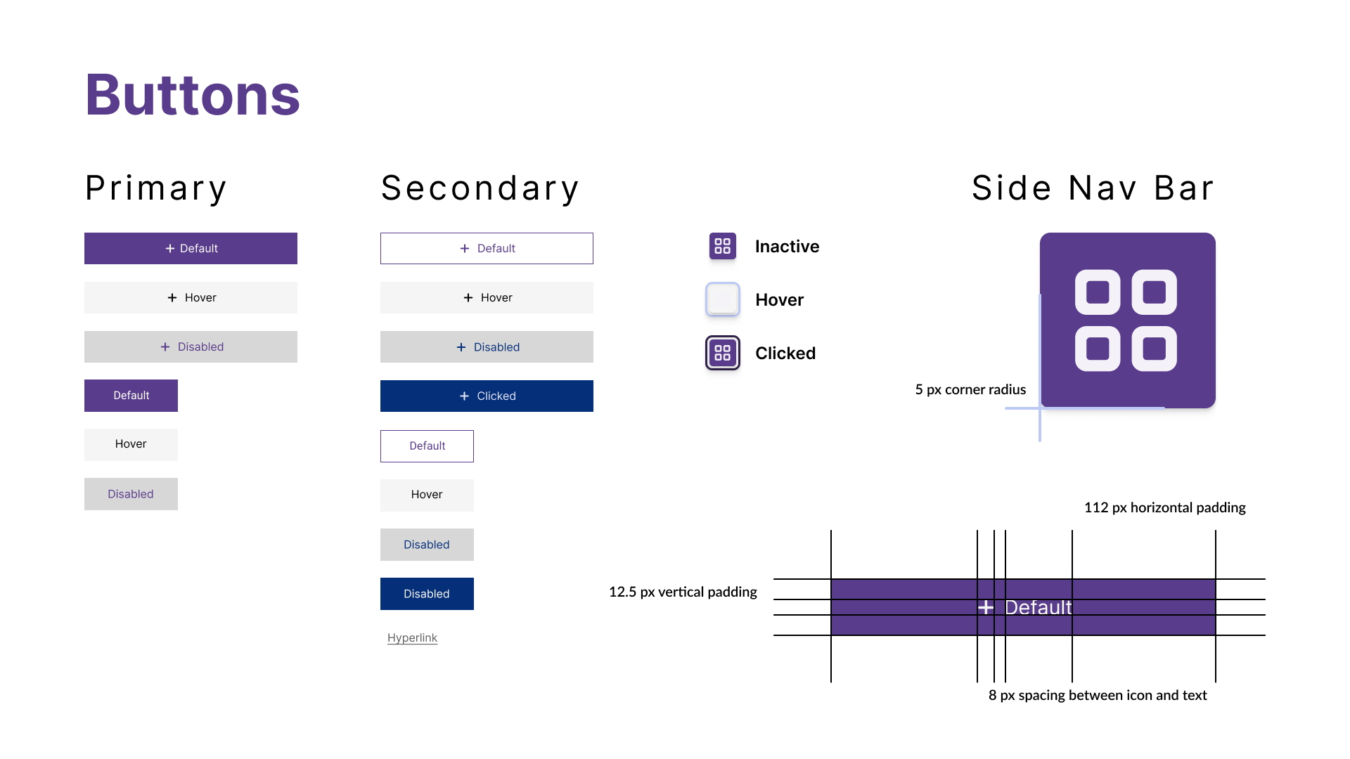
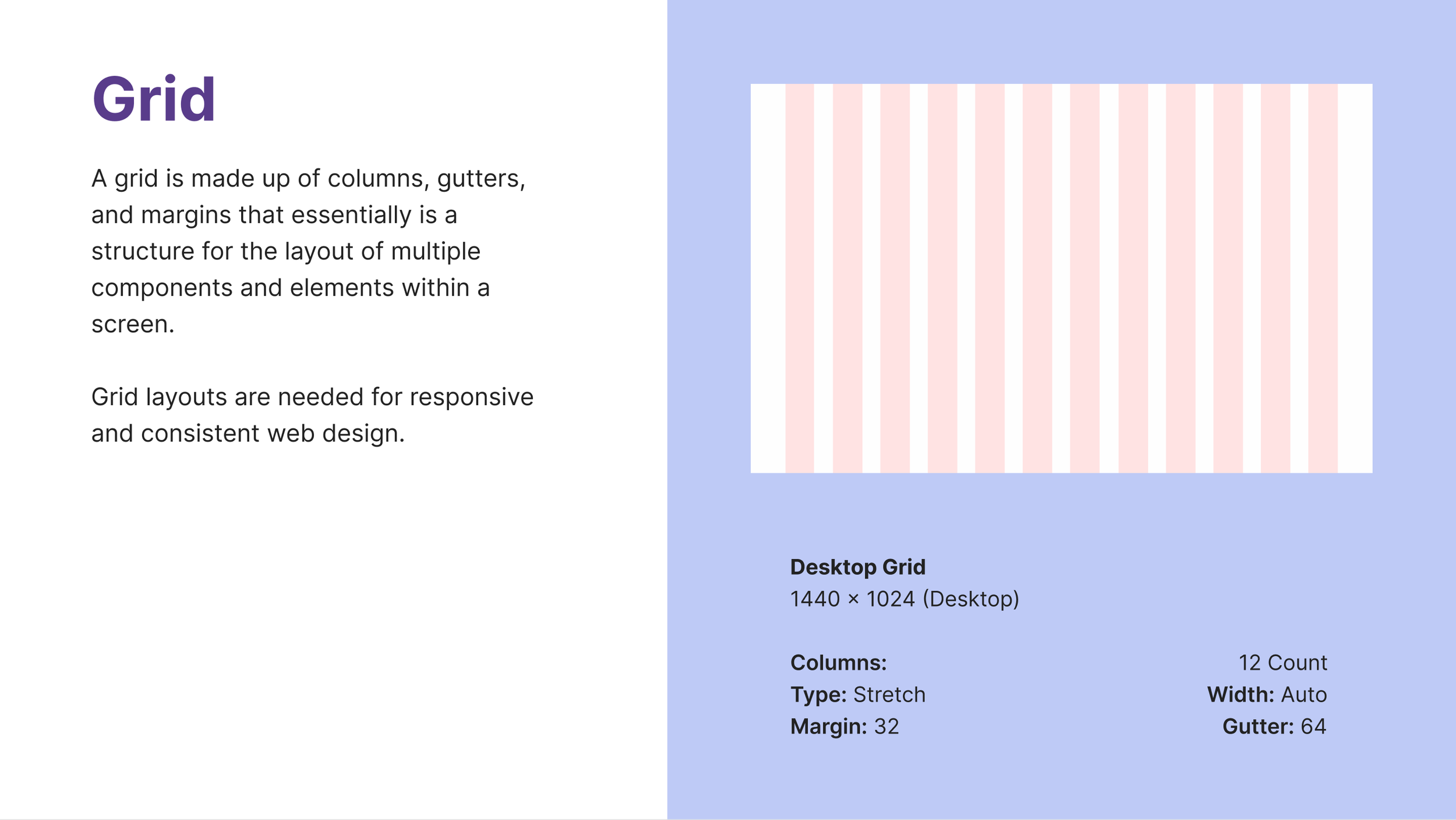
Design System
The chosen details in the style guide for our product were carefully selected to create a cohesive and engaging user experience. The typography, colors, components, and other design elements were thoughtfully considered to align with the company's brand identity and enhance usability.
By maintaining consistency and incorporating visual hierarchy, we aimed to improve readability, convey information effectively, and establish a visually appealing interface that resonates with sales and customer success users.
Design

Hi Fidelity Screens

Dev. Handoff

Developer Handoff Annotations
Detailed design specifications were documented to streamline communication, minimize errors, and ensure the accurate implementation of the design into a functional product.
Dev. Handoff

Reflection

Learnings
This project showed me how important it is to use the right components from the start. By designing the homepage and client dashboard with consistent components, we helped our team work better together and made the design process faster.
I enjoyed proving that B2B products can be both functional and user-friendly.

Thanks for Reading!
Thank you for reviewing my Samepage case study. Feel free to reach out with any questions or for further discussion.


