VIEWSTATS
by MrBeast
How I Reduced User Dropoff with an Intuitive Onboarding Process
Under NDA: Some details are anonymized or vague.

Viewstats is an analytical web application that provides YouTube creators with insights that guide them to make data-driven decisions to grow their channels.
What is Viewstats?
My Role
We needed a better way to introduce a new complex feature called “Alerts”. The original solution was a 1 page form. But this was overwhelming, unclear, and lacked context about what to expect. I needed to rework this in a way that cleared this up, but was also concise, educational, and intuitive.
UX/UI Designer
The Challenge

The Original Design

How It Started
The original start to the "Alerts" feature was a form similar to the one seen to the right.
It's overwhelming, provides no context as to what this tool does, nor does it explain what to expect once the form is completed.
The Original Form

The Redesign Process

Users on various social media platforms (X, Reddit, LinkedIn, etc.) made it clear that the feature:
Was confusing - Users didn’t understand the form.
Provided low value - Users didn’t understand the purpose.
Was overwhelming - Landing on a page with 6 input fields, mixed with the confusion led to cognitive overload.
Secondary Research - Social Listening
What users had to say online…
“I have no idea what this does or what it’s about, so I just don’t use it”
“I completed the form, which takes me to the next page. But I don’t understand how this is meant to be used to help me”
Research
I knew that the user needed to be educated and the process needed to be simplified and more intuitive.

More Research - Direct User Feedback
To further validate my findings from social listening, I analyzed direct user feedback collected through support channels and user complaints.
Common themes emerged regarding the feature’s usability challenges.
These insights reinforced the need for a simplified onboarding experience that educates users before requiring input.
The breakdown of the feedback…
33% of users mentioned feeling overwhelmed by the number of fields in the form.
47% of users expressed confusion about the purpose of the feature and how it benefits them.
24% of users requested a step-by-step breakdown or a more visual way to understand the process before interacting with the form.
Research

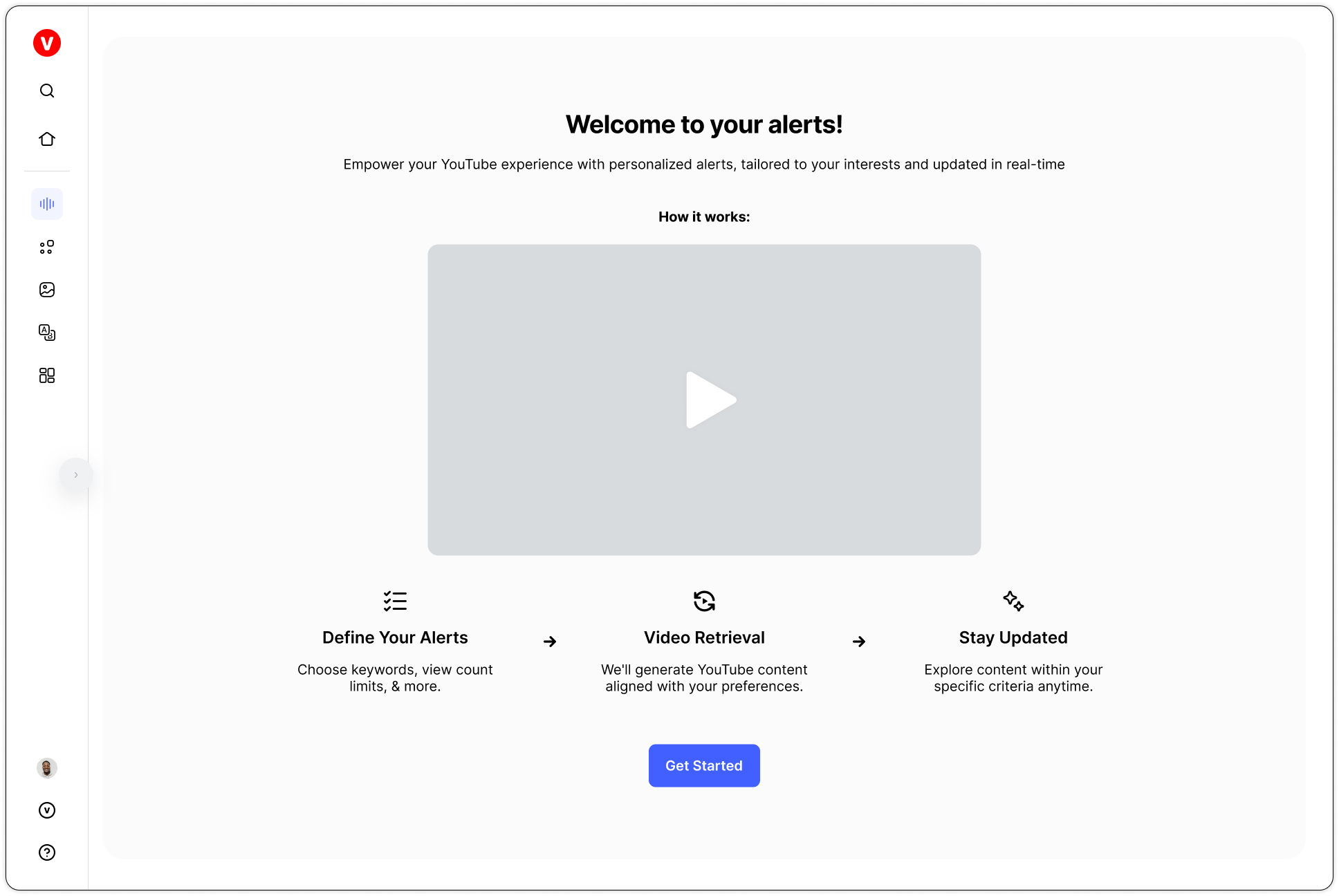
Intro Screen
Guide - Step 1

Card Sorting Workshop
I led the team through a card sorting exercise to figure out how best to order the steps, and to remove/add steps as necessary.
Ideation
Key
Original Steps
New Steps
Original Solution
Name Alert
Choose Keywords
Input Custom Views
Choose Video Type
Choose Language
Input Inclusions
Input Exclusions
Updated Solution
The Intro
Choose Keywords
Input Incl./Excl.
Choose Video Type
Choose Views Threshold
Choose Language
Name Alert
User Feedback
Card Sorting Output
Understanding the Additions
The Intro - The user is now introduced to the feature to understand what it is and how it works.
Choose Views Threshold - Providing the user with preset options makes the process simpler and faster.
User Feedback - Understanding what users think of the process is useful data to help the team iterate and continuously improve the flow. To avoid user frustration I kept it minimal and optional.

How Might We…
With a 5+ step process, the user may forget what they inputted.
Also, this process is great for a first time user, but what happens when a user returns to the feature after their first use?
Ideation
How might we ensure the user can access what they’ve inputted so far, without having to backtrack in the process?
How might we optimize this process for the return user who may not need another step by step guide?
How might we cater to return users who may find the step by step guide more user-friendly and less overwhelming?
How Might We Statements
“How Might We” Solutions
Form for the Return User

Hi-Fidelity Screens
Design

Reflection

Key Improvements Overview
Introductory Feature Explanation
3-Step Infographic
Step-by-Step Onboarding
Streamlined Return User Experience
Impact
32%
drop off rate decrease (during onboarding).
47%
user engagement increase, as measured by completed interactions.
22%
user satisfaction score increase, based on post-onboarding feedback.
Looking Ahead…
If given more time, I would have prioritized direct user interviews and usability testing to further refine the onboarding experience.
Understanding user behavior through hands-on testing could have uncovered additional improvements, ensuring an even more seamless and effective interaction.

Conclusion

Thanks for Reading!
Thank you for reviewing this case study. Feel free to reach out with any questions or for further discussion.
Don’t forget to check out the full product here!


