Redesigning onboarding to make the valuable action visible.
Families who invited sitters to apply were twice as likely to convert to premium. The problem? That action was hard to find. I redesigned the journey to bring it forward.
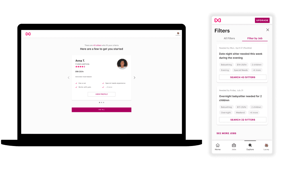
Sittercity is an online marketplace connecting families with local childcare providers. Families post jobs, browse sitters, and book care in one place.
Senior Product Designer · Two-person design team. I owned the sitter and match side of the product; this project touched both sides.
Families posted jobs. Then disappeared.
Posting a job was a dead end. Once families hit submit, the platform offered no guidance on what to do next, leaving match rates to stall.
Premium conversion was low, and Invite to Apply—the matching action associated with the strongest conversion cohort—was nearly invisible. The product opportunity was to connect job posting to relevant sitters and make the next action explicit.
Connect the data to the user’s blind spot.
Working with our PM, we uncovered the key signal: families who invite sitters to apply are twice as likely to convert to premium, one of Sittercity’s main revenue streams. The opportunity was to help more families discover and use that existing action.
An internal user at our parent company told us they did not even know inviting a sitter was an option. That signal reframed the problem: we were not dealing only with motivation or purchase intent. We had a visibility problem.
“It wasn’t a motivation problem. It was a visibility problem.”
Anthony Myrick-Lawson · Discovery synthesis
The next step should not be a guessing game.
Care.com and UrbanSitter did not simply drop families off after they posted a job. Their experiences educated users about the next steps and brought them into a sitter search already filtered for their needs.
Sittercity was doing neither. The audit helped identify a concrete gap in the journey: onboarding ended before families were equipped to participate in matching.
Care.com: filtered sitter search
Care.com brings families into a sitter list filtered for their needs.
UrbanSitter: guided next steps
UrbanSitter explains what happens next and guides families into matching.
Build a guided path after posting.
The direction from discovery was clear: educate families, surface the invite feature, and give them productive steps immediately after posting. I designed three connected interventions rather than an isolated new screen.
Welcome + How It Works
The most important screen explicitly teaches families about the invite feature. It recommends the action instead of assuming people will discover it themselves.
Filtered Sitter Match
Instead of a generic browse page, families land on search results pre-filtered by their job requirements. This reduces repeated effort and brings relevant sitters closer to action.
Get Started Checklist
A net-new checklist provides an anchor after posting. Clear, productive steps—including inviting a sitter—replace the previous dead end.
Carry the guidance into the actual interface.
I translated the guided journey into the welcome, matching, filtering, and profile experiences. The interface makes the recommended next step explicit and preserves the relationship between a family’s requirements and the sitters they see.
Prominent, high-contrast actions and clear status treatments make it easier to distinguish what a family can do from what has already happened. The work joins education with a usable path to the invite action.
Sitter profile: contact and status
The profile carries the guidance into the contact treatment, with clear actions and status information.
Test visibility—not a completely new feature.
The internal user signal gave us a testable hypothesis: showing Invite to Apply directly on the profile would make the action more discoverable. I ran an A/B test to validate that hypothesis at scale.
Control
Existing behavior: Invite to Apply is hidden behind Contact on sitter profiles.
Variant
Invite to Apply is surfaced prominently on sitter profiles.
Result
The high-visibility variant drove a statistically significant increase in invite actions, moving a larger share of new families into the platform’s highest-converting cohort. The measured test outcome was invite behavior, not a doubling of premium conversion. The test was still running when I left.
Make the most important action impossible to miss.
The redesigned journey connected job posting to guidance, pre-filtered sitter matches, and a visible invite action. The high-visibility A/B variant drove a statistically significant increase in invites, successfully moving a larger share of new families into the platform’s highest-converting cohort.
The 2× figure is the observed relationship between inviting sitters and premium conversion. It is not a claim that this redesign doubled overall conversion.
The commercial value is in moving more families toward a behavior associated with premium revenue. The evidence supports an increase in invite actions; it does not establish the size of a downstream premium-conversion lift.
“Sometimes the most impactful design decision isn’t a new feature, it’s making an existing one impossible to miss.”
Anthony Myrick-Lawson · Project reflection
likelihood of premium conversion for families completing the target action