Building Viewstats from web platform to native iOS.
As Founding Designer, I built Viewstats’ 0-to-1 web platform from scratch with one other designer; it reached 500k+ creators in approximately six months. As Design Manager, I then led its first native iOS companion, translating dense analytics across 40+ views.
This case study contains limited visuals due to an NDA.
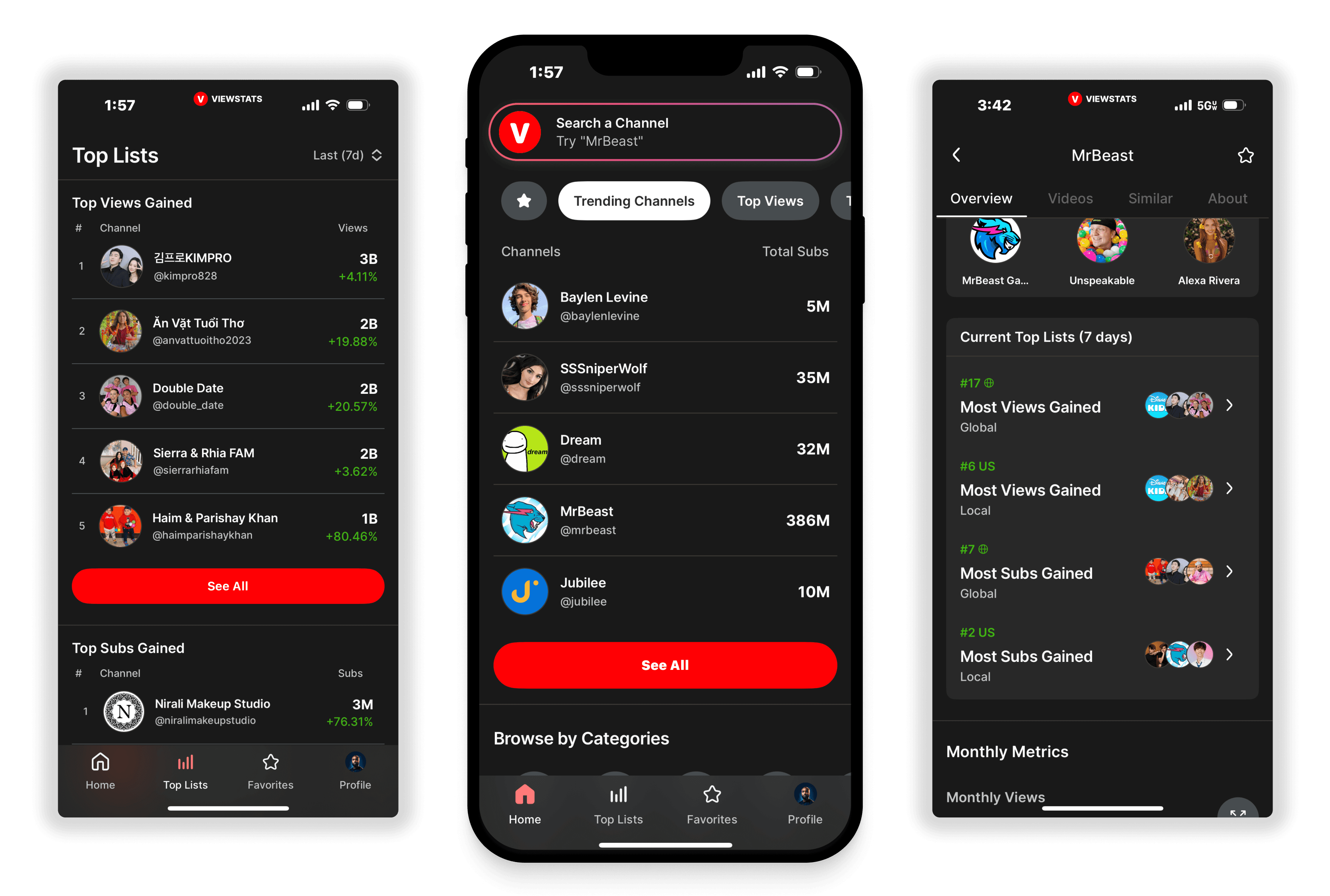
Viewstats helps YouTube creators analyze performance and grow their channels. This story covers two 0-to-1 chapters: the web platform built from scratch, followed by its native iOS companion. The visuals below focus on the iOS work.
Founding Designer → Design Manager · Built the web platform with one other designer, then led iOS architecture, design-system development, hands-on design, mentorship, and engineering collaboration across 40+ views.
The first chapter: a web platform built from scratch.
As Founding Designer, I worked with one other designer to build the 0-to-1 Viewstats web platform. We established the product experience for creators analyzing channel performance, comparing videos, and finding growth opportunities.
The web platform reached 500k+ creators in approximately six months. That is platform traction achieved by the web build—not an adoption result for the later iOS app. In post-launch platform research, I initiated a survey that informed user education and substantially reduced support tickets.
The next chapter changed both my ownership and the design problem: as Design Manager, I led the 0-to-1 native iOS companion, with responsibility for the architecture, design system, and translation of dense analytics across 40+ views.
From multi-monitor dashboards to one-handed scanning.
The web product supported sustained analysis across dense dashboards. As more creators asked for access on the go, the company invested in a native iOS companion for quick performance checks between posts.
I organized the mobile experience around finding a channel, scanning its current performance, and opening deeper analytics when needed. Across 40+ views, the architecture had to preserve access to detailed data without making every quick check feel like a desktop research session.
Find a mental model for dense information.
The mobile YouTube analytics space was relatively underserved, so I encouraged the team to look beyond direct competitors. Financial apps such as Robinhood and Public offered strong examples of complex information made useful in a small format.
The useful precedents were specific mechanics, not a visual style: sparkline micro-charts for a quick trend read, baseline delta badges for ±24h performance, and progressive-disclosure cards that separate a summary from its supporting detail. These patterns informed how we translated creator analytics into a compact hierarchy.
- Sparkline micro-charts communicate direction without opening a full chart.
- ±24h baseline delta badges make the comparison period explicit.
- Progressive-disclosure cards support scanning first and deeper inspection on demand.
Establish reusable patterns on high-frequency surfaces.
I used Home, Top Lists, Favorites, and My Profile to establish the iOS system’s atomic visual patterns, color tokens, and layout primitives. These high-frequency browse surfaces put search, ranked rows, reusable cards, and account navigation into repeated use before we tackled multi-dimensional visualizations.
This was a systems decision, not simply an easier-screens-first sequence. Resolving hierarchy, spacing, card structure, and semantic color on those surfaces gave the team a shared foundation for 40+ views. Channel and video analytics could then reuse established primitives rather than require a separate visual language.
Home: search and discovery
Establish a clear starting point for finding channels and discovering categories.
Top Lists: browse rankings
Apply the foundation to browsable rankings and category-based discovery.
Favorites: followed channels
Keep followed channels in a focused list using the same reusable patterns.
My Profile: account navigation
Extend the mobile language to settings and account navigation.
Make deeper analytics feel navigable.
With the foundation established, we moved into Channel Overview and Video Detail. These areas bring together dense analytics, view curves, subscriber trends, similar channels, engagement, A/B tests, and title changes.
Scrollable cards and lightweight tabs separated summary metrics from deeper comparisons and change history. The architecture connected browse surfaces to Channel Overview, Video Detail, and Change Gallery, so creators could move from a quick scan into multi-dimensional analysis without losing channel or video context.
Channel Overview
Prioritize the channel’s performance, then use tabs and scrollable content for videos, similar channels, and about information.
Video Detail and Change Gallery
Bring performance and changes into the same journey, making it easier to understand a video’s history without losing context.
Connect channel performance to discovery.
I proposed and designed “Current Top Lists,” a module for the Channel Overview page. It adds ranking context directly to the channel experience instead of requiring a separate search.
This made a creator’s current relevance easier to understand and created a natural path from a single channel into broader discovery. The module links contextual performance to the full Top List experience.
Lead the team while staying close to the work.
This was not a strategy-only or handoff-only role. I balanced the product direction with daily design execution and implementation support.
Mentorship and guidance
I led daily critiques and feedback sessions with two designers, helping them build clarity, consistency, and user-centered thinking.
Design-to-engineering partnership
I owned the collaboration from spec documentation to QA reviews, keeping the visual and functional goals aligned as the work moved into implementation.
Weekly product prioritization
I defined priorities with the PM, balancing feature feasibility with user value instead of treating the design backlog as a list of screens.
Native iOS quality
I worked closely with iOS developers on Apple Human Interface Guidelines and platform-specific design challenges.
Web traction. Native iOS design delivery.
The founding-design chapter helped deliver the web platform that reached 500k+ creators in approximately six months. Platform research also informed education that substantially reduced support tickets. These are web-platform outcomes.
The Design Manager chapter delivered a native iOS architecture, reusable design system, and density translation across 40+ views. I crafted key flows, directed reviews, and partnered with engineering on specs and QA. I departed before the mobile launch; the design shown reflects April 2025, and the App Store image documents the subsequently published app. No mobile adoption result is claimed.
A shared system made the leadership work concrete.
Moving from founding design to management meant changing how I multiplied my contribution without stepping away from execution. Browse-surface primitives gave critiques a common reference; explicit data hierarchy gave product and engineering a basis for scope decisions; spec documentation and QA carried those decisions into the native build.